Squarespace Layout Tips

Squarespace Website Design Recap for HiView Solutions :: Fulton Template.

Hello and welcome to a ConnectionMade Design project recap. My name is Andy and I want to take a moment and walk you through one of our Squarespace design projects. It's my hope that you find these project recaps a source of inspiration for your own Squarespace projects.


The Introduction

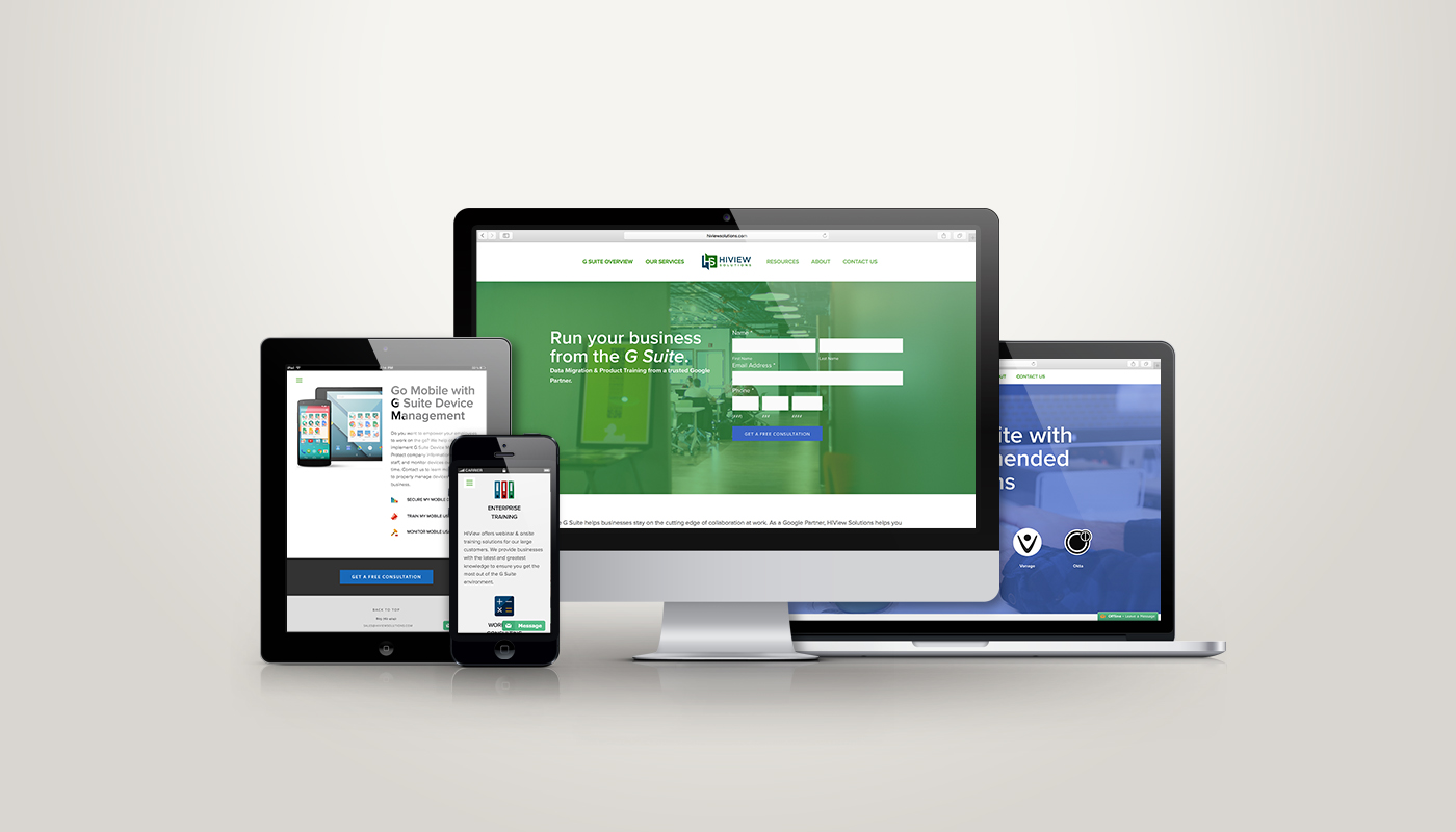
Miles, from HiView Solutions, reached out to me in need of some help with customizing and making his Squarespace website look like those who were offering the same service, but making upwards of $1,000,000/yr in revenue. He had put his Squarespace site together, but couldn't get it to portray professionalism at a high-level. After viewing some of his competitor's websites, we discussed what they did well and how we could match, or even exceed, what they were doing.


The Needs

  • Make the design look high-level and professional.
  • Organize content in very "consumable" sections.
  • Make icons uniform in size across all screen sizes.
  • Design a robust footer that stands out and is very functional. 
  • Come up with an easy, low-cost system for reproducing the look of blog post graphics.

The Squarespace Template

Fulton: http://fulton-demo.squarespace.com/


The Outcome

Miles is thrilled with how his site turned out! He feels like the site far exceeds his expectations and gives him equal footing with those who are offering the same sort of services. 

As soon as the new homepage loads, it feels and looks high-level and professional. There's a call-to-action form over the main banner, which compared to the old one, fits with the brand and industry that HiView Solutions is in. Also, as you scroll down, content is broken up into separate sections. This provides visual interest and increases the likelihood that someone will engage with the content.

Having style and size uniformity with icons will negatively or positively impact the overall design of a webpage. Icons should enhance and complement the content they are coupled with, so if they are displayed awkwardly, they become more of the focus. Before we tweaked the look, size and layout of the icons, it was a hot mess! It's especially important to watch icon sizes when the website is displayed in a single column, like on a mobile phone.

One thing that we noticed while researching other websites in HiView Solutions' industry was the robust footers they used. The goal for us was to create something that felt "big" without being cluttered. We wanted this area to be very helpful and functional to those viewing it. 

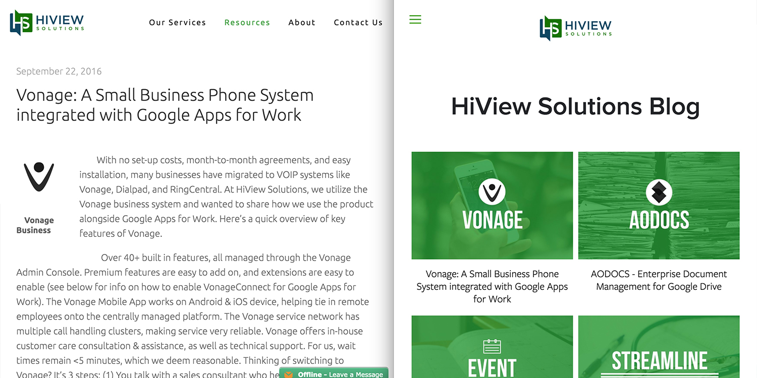
We wanted to set up Miles with the ability to maintain his site at a high-level. One area that this can often breakdown when we are not involved with regular, on-going upkeep, is in the uniformity of graphics. Much like icons, size and style are important here. So, we introduced Miles to Canva. Canva is a free, web-base design program. We were able to create the blog post thumbnails using Canva, and share the project file so Miles can duplicate what we did.


Closing

I hope you find some ideas and inspiration for your own Squarespace project from this recap. If you want to find out some more about this project, check out the video below. If you have any questions, or would like help designing your Squarespace website, please, reach out.


Squarespace Website Design Recap for Journey Church :: Bedford Template.

Squarespace_Journey Church_Responsive.jpg

Hello and welcome to a ConnectionMade Design project recap. We specialize in designing professional, eye-catching Squarespace websites for companies, churches and creatives. It's our hope that you find our project recaps a source of inspiration for your Squarespace project.


The Introduction

JJ, from Journey Church, reached out to me in need of some help with his Squarespace website. He had started, and nearly finished, the site for a new church launch, but wanted some help customizing the homepage. He provided a few sample sites containing some features that he wanted to implement on his church's site, but couldn't figure out how to do it within the limitations of this particular Squarespace template. 


The Needs

  • Optimized for mobile. There were some elements that overlapped or weren't fitting well on mobile.
  • An animation reveal when hovering over a section of information. They provided the "Serve at IBC" section of irvingbible.org as inspiration.
  • A custom slideshow gallery that would serve as a Testimonial section. This section needed to have a close-up of the person's face, but a different, "action" photo, for the background of the testimony text. They provided storybrand.com as inspiration.
  • Custom buttons.
  • Suggestions on improving the overall look and flow.


The Squarespace Template

Bedford: http://bedford-demo.squarespace.com 


The Outcome

JJ really likes the way the site turned out! While the inspiration site were helpful, I found a couple areas where they lacked, specifically at smaller screen sizes. I wanted to be sure that the customizations we made to this church's website was thought out, optimized for mobile viewing and responsively flawless.  

Squarespace Design_Journey Church_SidebySide1

The animation section in the sample site (left above) looks really nice, but when you minimize the browser window, you notice how one of the three blocks moves down and the text area is aligned to the left.  I wanted all the blocks to stack once the window size became a certain size (right above). This section also included custom buttons. The buttons native to Squarespace don't allow the addition of icons. 

Squarespace Design_Journey Church_SidebySide2

The sample site for the testimonial section looked great, but lacked when viewed on a smaller screen. On a small screen, only one of the three thumbnail photos appeared (left above). So, clicking on and reading the others wasn't possible. Of course this isn't desirable with the rapidly increasing numbers of mobile viewers. We made sure that all three thumbnails were visible, regardless of screen size (right above). 

Squarespace Design_Journey Church_SidebySide3

At the bottom of the page they had an email block embed from a third-party provider. The problem was that the default style (left above) was far from the overall style of their church's site. So, through some HTML and CSS code injection I was able to change the look of this email block to match their style (right above).


Closing

I hope you find some ideas and inspiration for your own Squarespace project from this recap. If you want to find out some more about this project, check out the video below. If you have any questions, or would like help designing your Squarespace website, please, reach out.