
Hello and welcome to a ConnectionMade Design project recap. We specialize in designing professional, eye-catching Squarespace websites for companies, churches and creatives. It's our hope that you find our project recaps a source of inspiration for your Squarespace project.
The Introduction
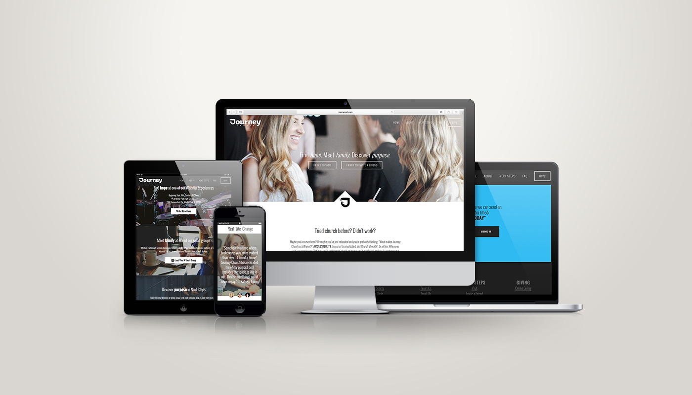
JJ, from Journey Church, reached out to me in need of some help with his Squarespace website. He had started, and nearly finished, the site for a new church launch, but wanted some help customizing the homepage. He provided a few sample sites containing some features that he wanted to implement on his church's site, but couldn't figure out how to do it within the limitations of this particular Squarespace template.
The Needs
- Optimized for mobile. There were some elements that overlapped or weren't fitting well on mobile.
- An animation reveal when hovering over a section of information. They provided the "Serve at IBC" section of irvingbible.org as inspiration.
- A custom slideshow gallery that would serve as a Testimonial section. This section needed to have a close-up of the person's face, but a different, "action" photo, for the background of the testimony text. They provided storybrand.com as inspiration.
- Custom buttons.
- Suggestions on improving the overall look and flow.
The Squarespace Template
Bedford: http://bedford-demo.squarespace.com
The Outcome
JJ really likes the way the site turned out! While the inspiration site were helpful, I found a couple areas where they lacked, specifically at smaller screen sizes. I wanted to be sure that the customizations we made to this church's website was thought out, optimized for mobile viewing and responsively flawless.

The animation section in the sample site (left above) looks really nice, but when you minimize the browser window, you notice how one of the three blocks moves down and the text area is aligned to the left. I wanted all the blocks to stack once the window size became a certain size (right above). This section also included custom buttons. The buttons native to Squarespace don't allow the addition of icons.
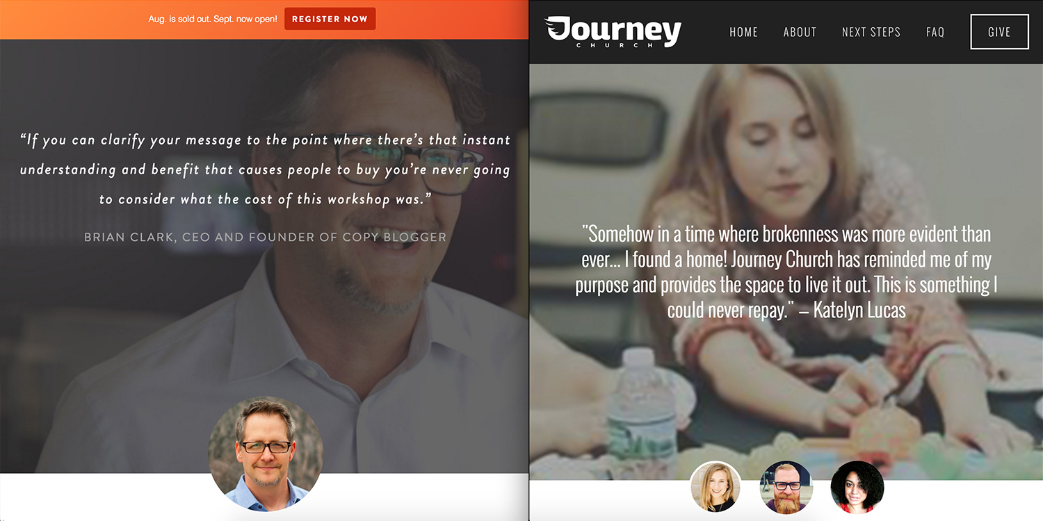
The sample site for the testimonial section looked great, but lacked when viewed on a smaller screen. On a small screen, only one of the three thumbnail photos appeared (left above). So, clicking on and reading the others wasn't possible. Of course this isn't desirable with the rapidly increasing numbers of mobile viewers. We made sure that all three thumbnails were visible, regardless of screen size (right above).

At the bottom of the page they had an email block embed from a third-party provider. The problem was that the default style (left above) was far from the overall style of their church's site. So, through some HTML and CSS code injection I was able to change the look of this email block to match their style (right above).
Closing
I hope you find some ideas and inspiration for your own Squarespace project from this recap. If you want to find out some more about this project, check out the video below. If you have any questions, or would like help designing your Squarespace website, please, reach out.
